
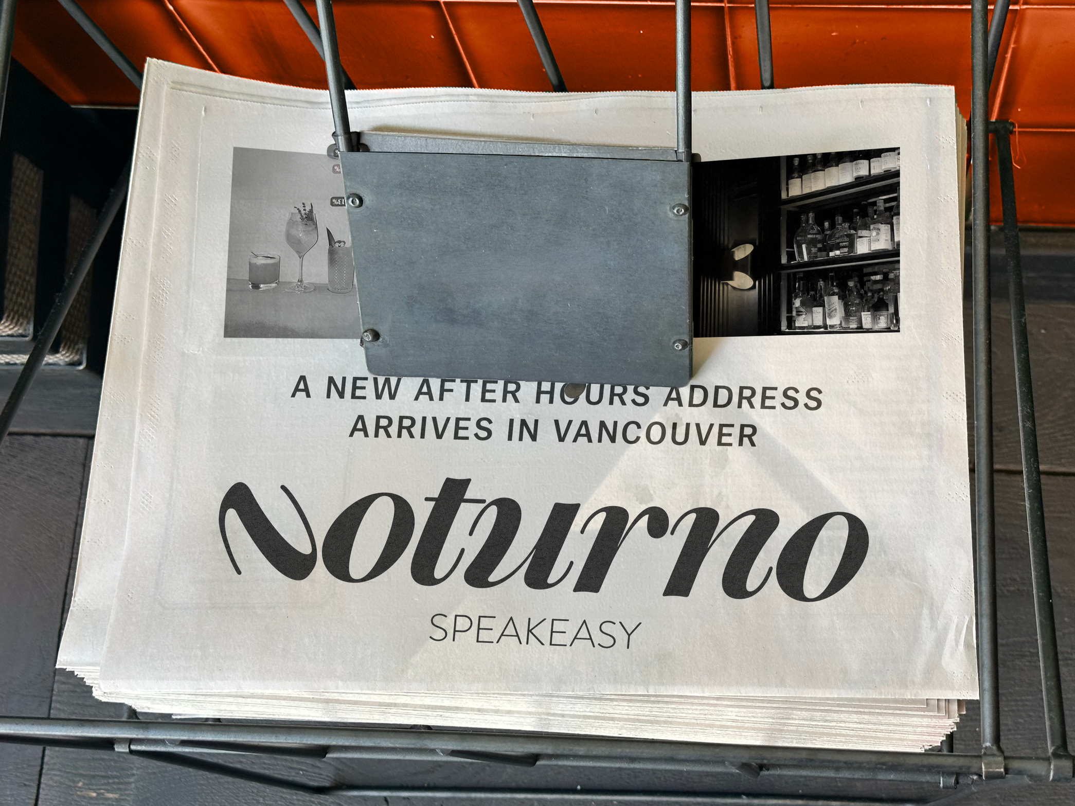
Noturno Speakeasy
For those who already know where to look.
No one has to tell them twice.
Client: Fictional / Concept
Role: Brand Identity, Art Direction
Year: 2026
OVERVIEW
Noturno Speakeasy is a brand identity for a cocktail lounge designed for Vancouver's after-hours culture. The project explores how branding can shape not just perception, but behaviour, encouraging people to slow down, stay longer, and engage more intentionally with their surroundings. The identity needed to feel intimate, social, and refined without relying on spectacle.
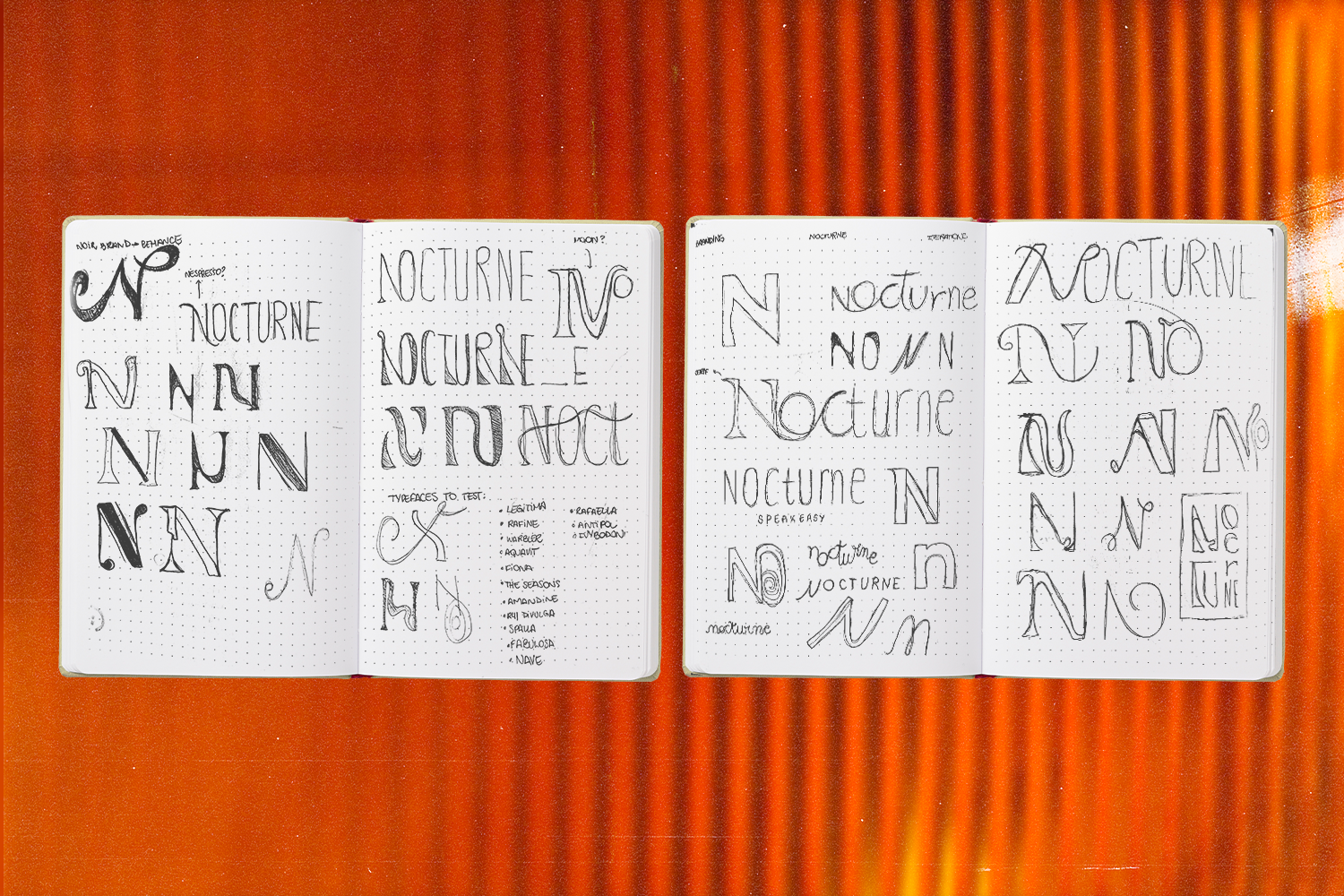
From the start, the intention was for typography to carry the brand's entire personality. An identity that speaks for itself, without needing to explain or decorate.
The process began with dozens of iterations of the initial "N," testing how subtle shifts could change its tone. Curves versus sharp edges, weight versus restraint. Each version pushed the mark toward a different atmosphere, some warmer, some colder, some trying too hard to be noticed.
The answer was the version that needed the least: quiet, confident, and intentional.
PROCESS
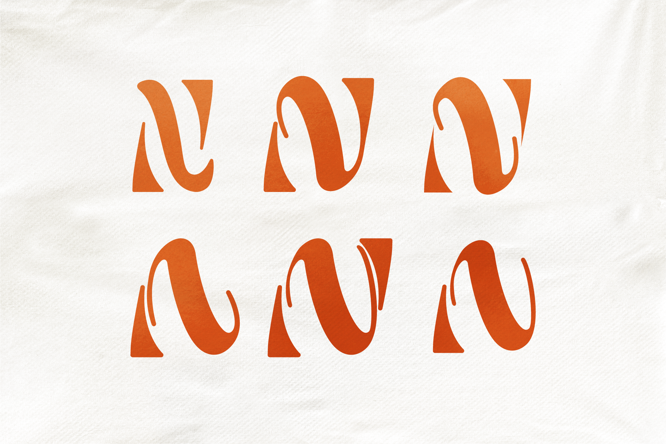
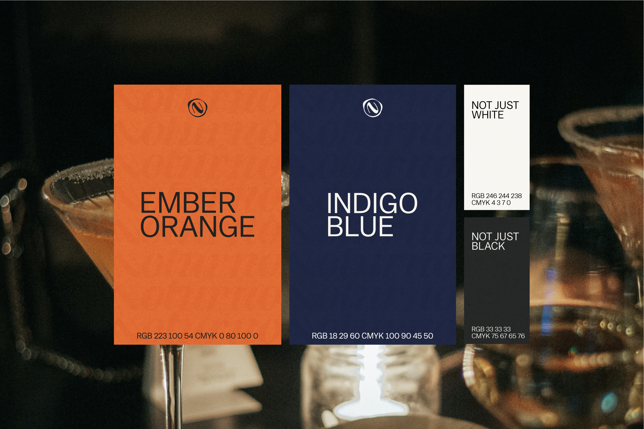
THE IDENTITY
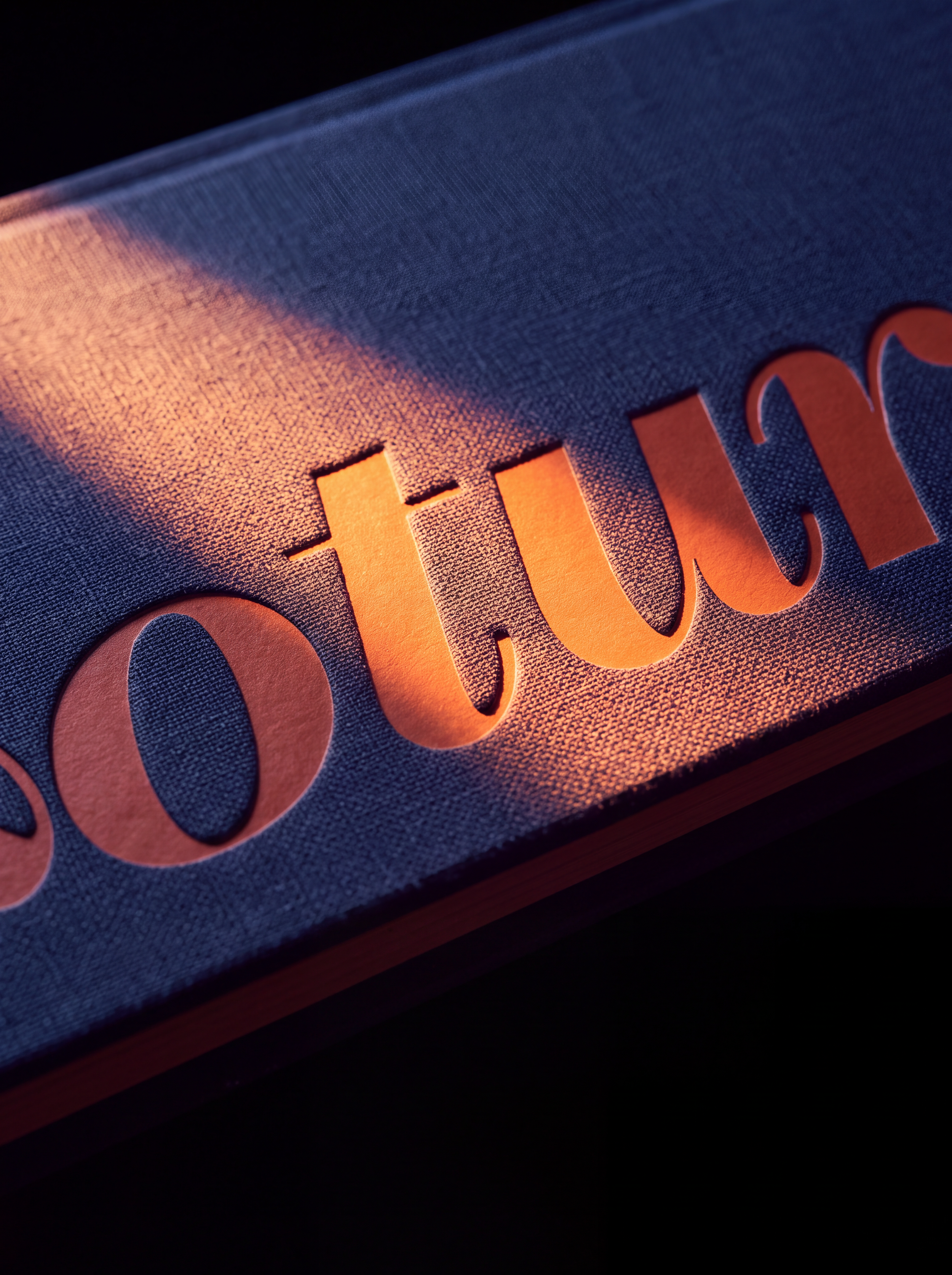
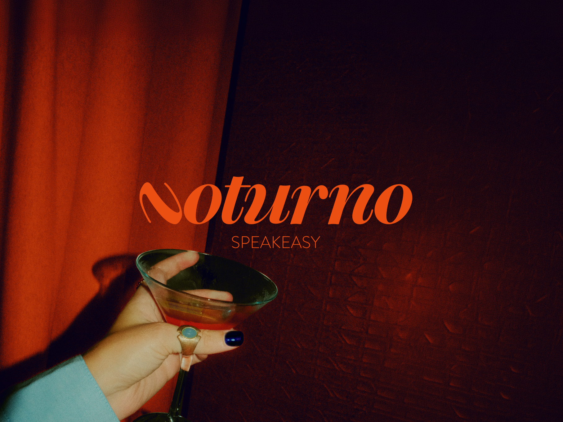
The final mark strips everything back to a single confident "N," paired with clean, unfussy type across the rest of the system. Nothing decorative, nothing extra, just Noturno.
THE MENU
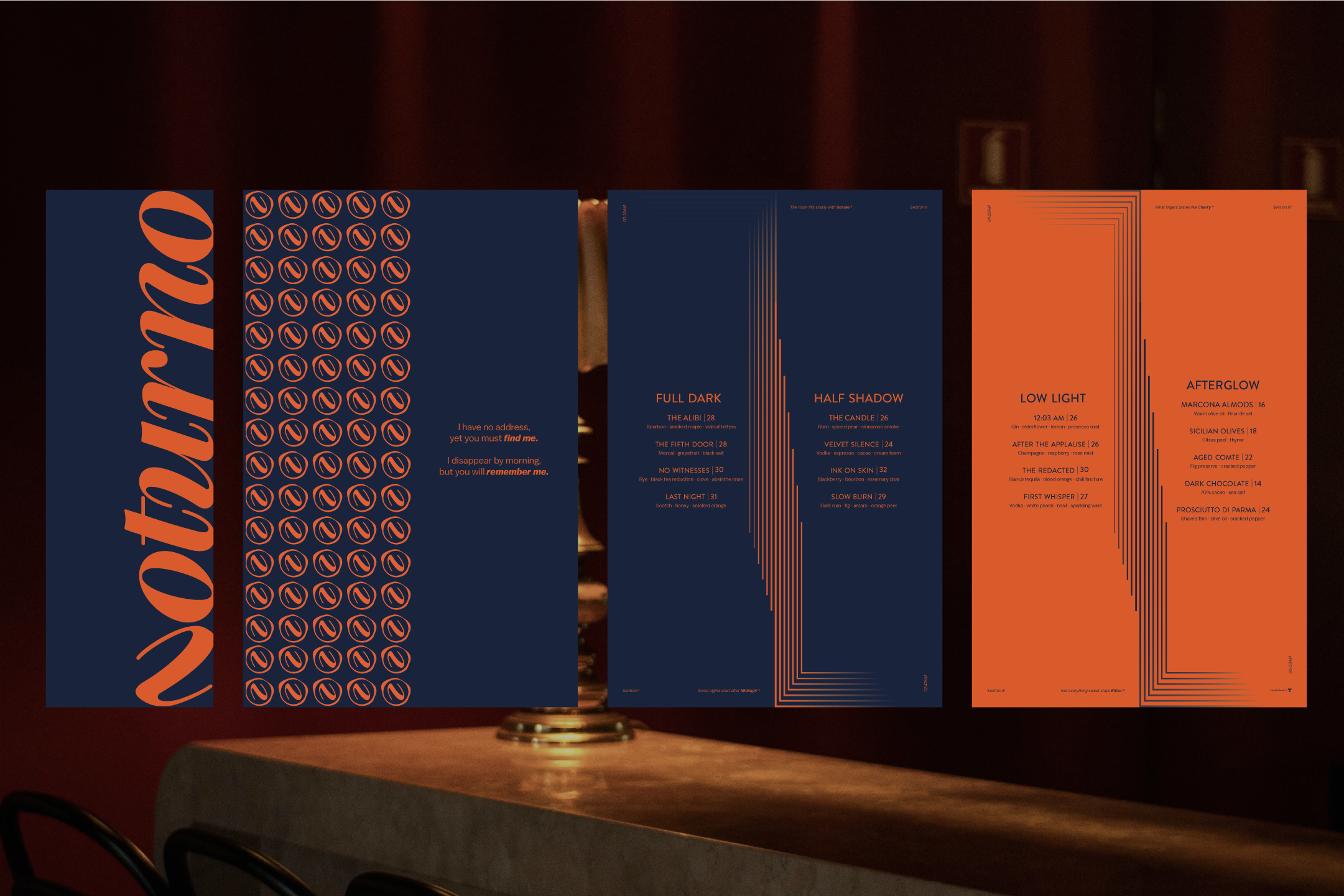
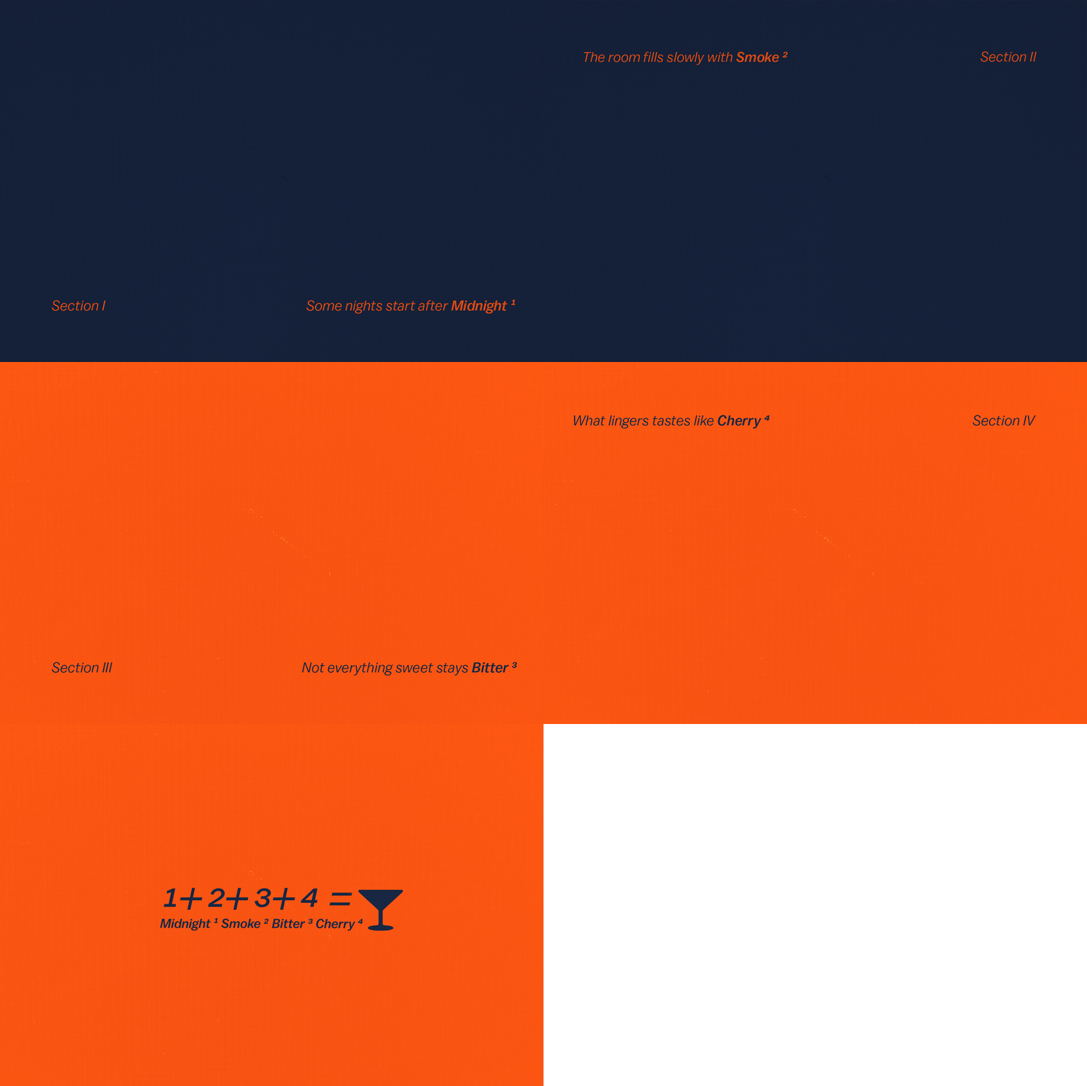
Designed to reward those who look closely. Each page carries a small timestamp in the corner, quietly marking the hours between arrival and last call. Read every section in order, and the first word of each one spells out the name of a secret cocktail. Not announced, not explained. Just there, waiting to be found, exactly like Noturno itself.
BRAND IN USE
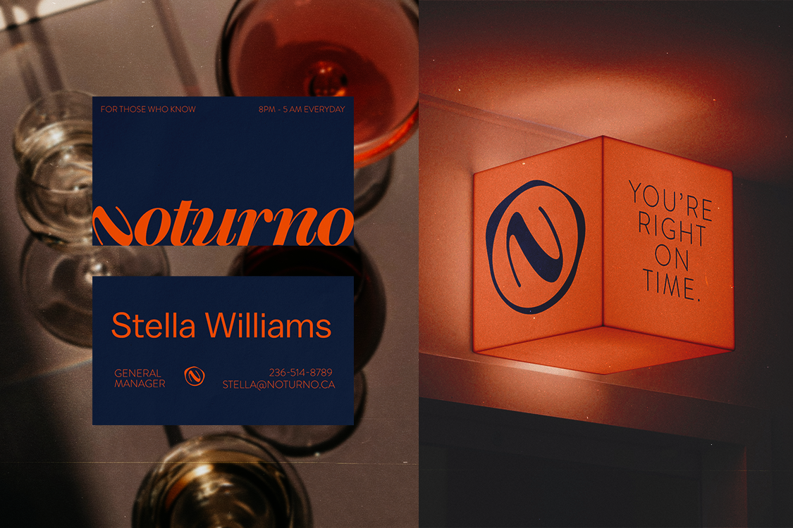
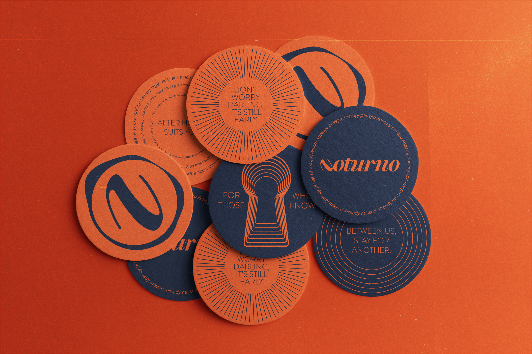
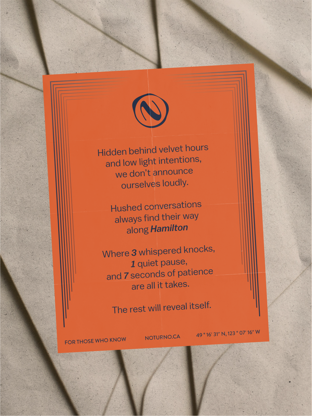
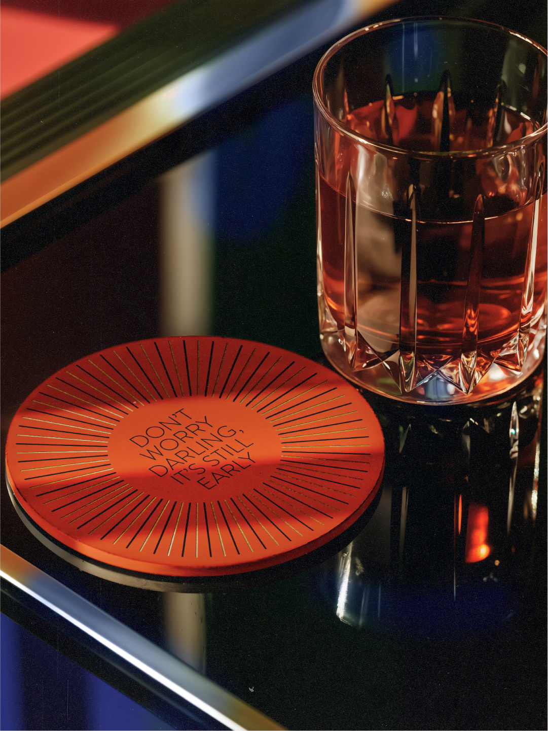
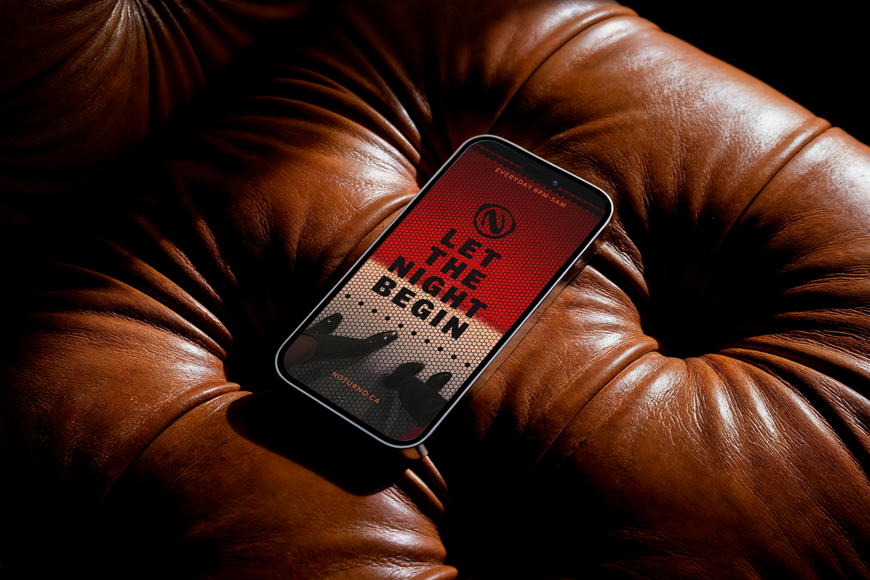
Using the brand's expressive elements, Noturno extends its identity into the physical world, consistent across every touchpoint it appears on.
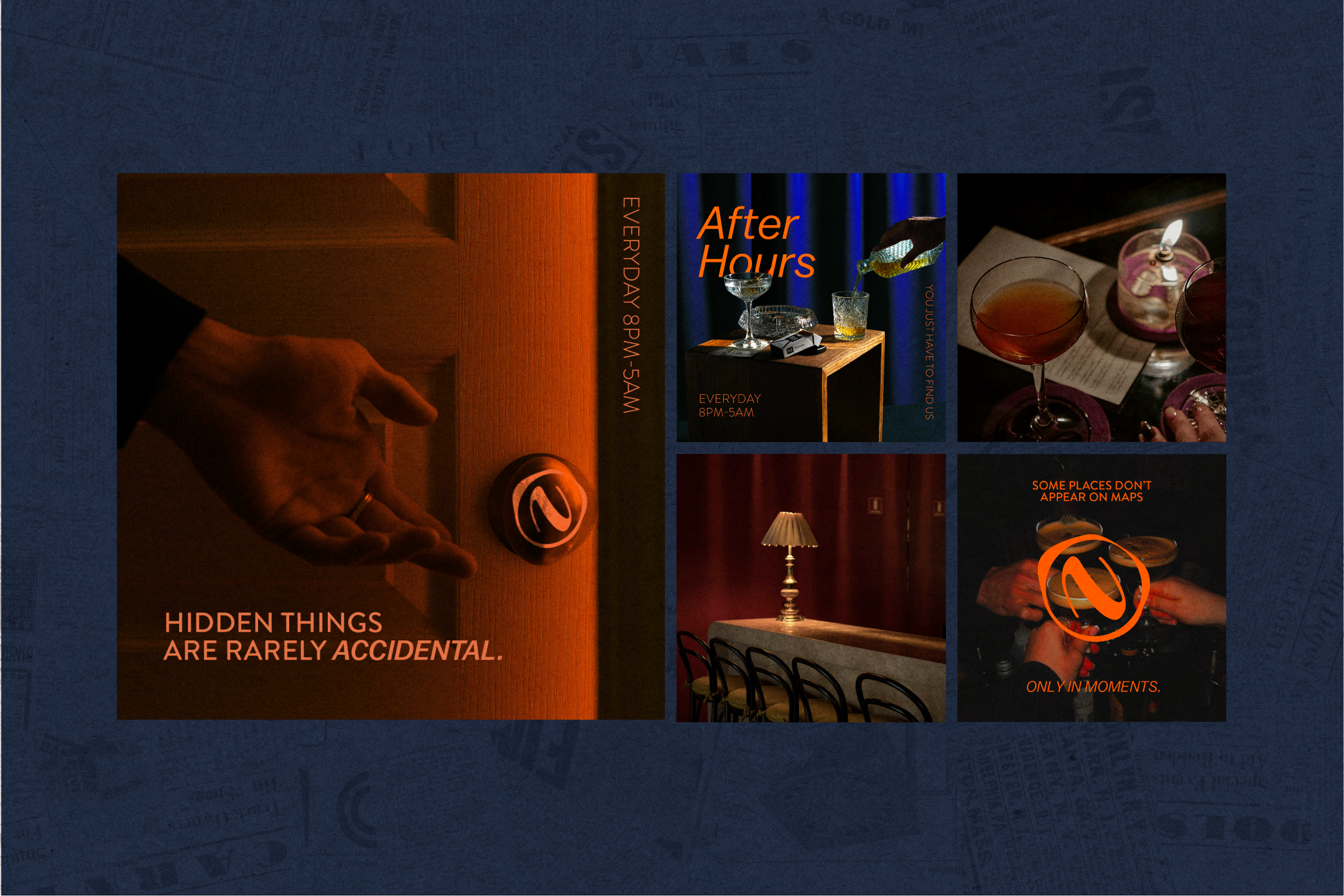
THE SOCIALS
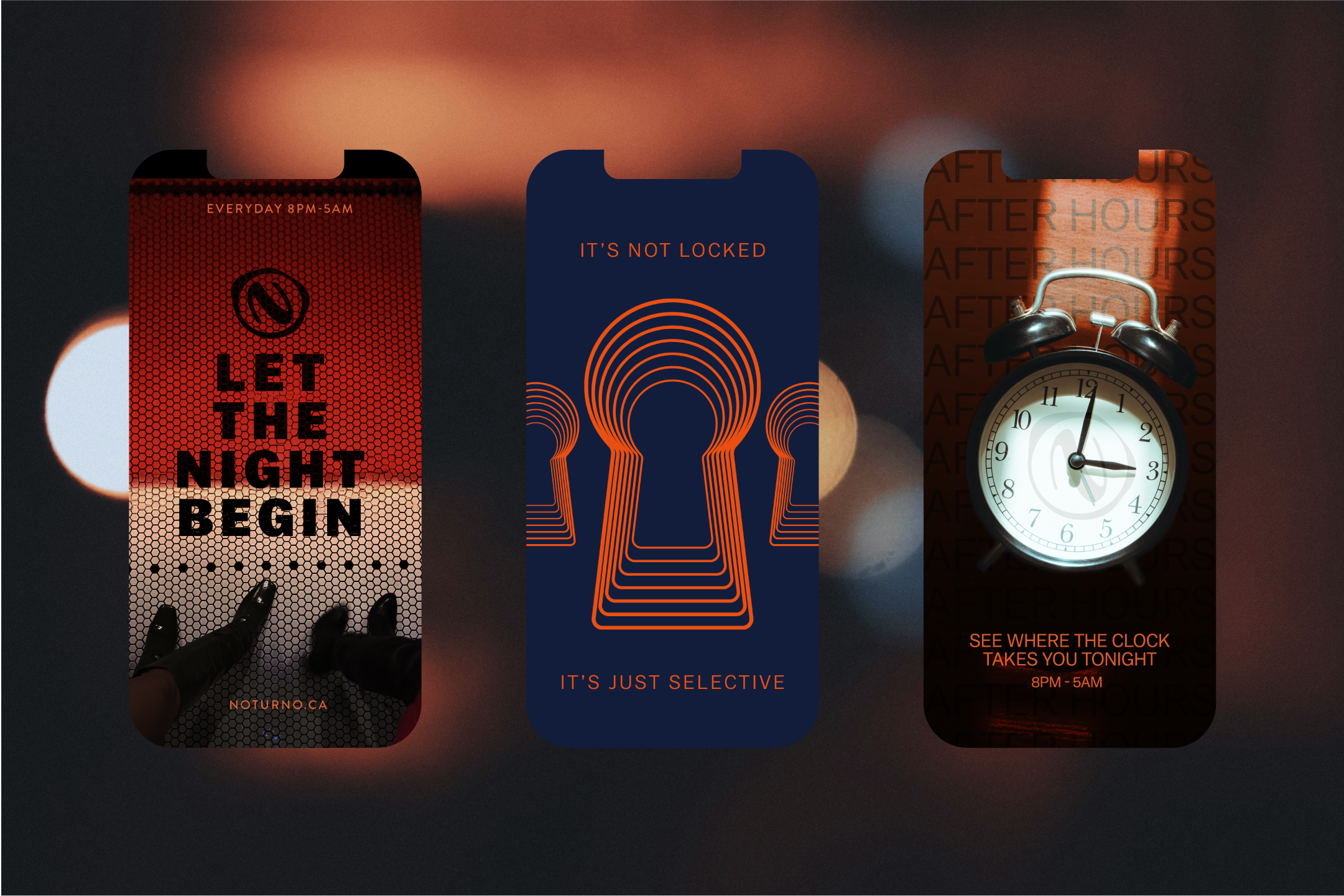
Built as a sequence, not a set. Each post narrows the question until only the invitation is left.
Noturno Speakeasy
Nothing about Noturno was designed to be seen first. Only remembered after.
CREDITS
Concept, identity, and art direction by Helena De Aguiar Schnaider | Fictional brand, created for educational purposes | Stock imagery, used for concept presentation only | Warbler Deck, Brandon Grotesque & Balto typefaces, used under license for non-commercial student work.